Xiggit
Empowering employees to start saving

Xiggit
Empowering employees to start saving
A design collaboration with Springboard and Xiggit.
This project focuses on the redesign of the onboarding process for Xiggit's iOS app.
Company Overview
Xiggit is a start-up with about 10 employees, helping people save money through financial tools: creating emergency savings, building freedom savings, and earning money from their Boost game. They have existing research and an existing high fidelity design, the app has been launched with existing employees for a construction company.
Business Challenges
Xiggit is seeking a revamp of its existing onboarding process due to several concerns. According to their analytics, users successfully open savings accounts but fail to actively engage with the app. There is apprehension regarding the bank account linking screens, which are currently presented without providing any contextual information about the app.
The Problem
How do we acknowledge users' pain points (even when not saving) to increase user engagement and trust?
-View Xiggit's Existing User Flow -
Team
Carmela Abraham (Chief Product Officer)
Camila Benedetti (Marketing Coordinator)
Ambre Hautot (UX/UI Designer)
Michael Beaton (Software Engineer)
Keith Cobell (Advisor; Customer Delight)
Claudette Cariño
Jing Guo
Zhi Qiu
Role
UX Designer
UI Designer
UX Researcher
Duration
4 weeks (80 Hours)
Target Audience
Dollar store shopper
Age 25 and older
Low Income
Capable of spending money
Using up what they have
Hypothesis
Users may have a lack of knowledge/education to reach their financial goals. Users may be too young or do not believe they have the money to start saving
Research
I read scholarly articles, personal stories, and online articles to gather research about our target audience.
Here’s what I found:
Low-income families with savings are more financially resilient than middle-income families without savings (McKernan)
3 major reasons that stop low-income users from using a formal saving account: access, knowledge and understanding, and attractiveness of formal products.
Having a clear understanding of what financial health is can help (Smith)
-Click to read more-
Interview Insights
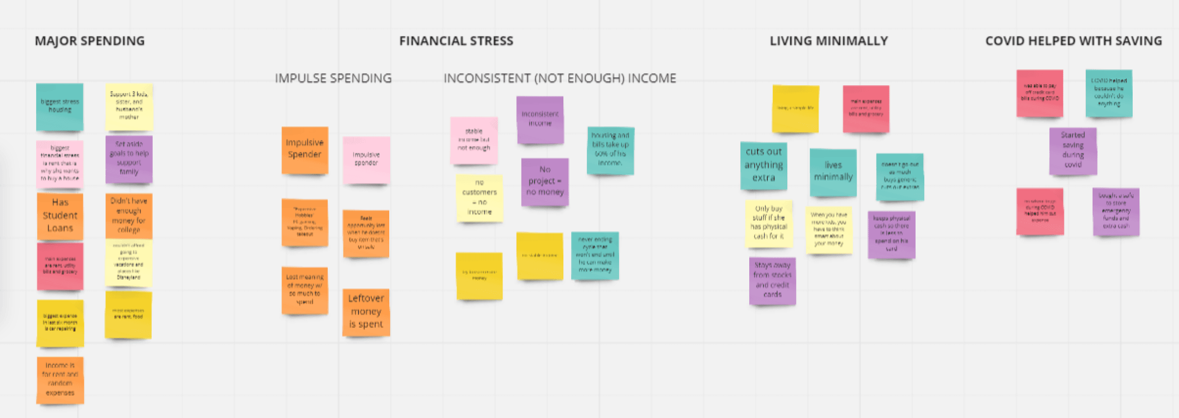
Reaching out to people to interviewing was challenging, especially during the peak of a pandemic. My team and I used Facebook, grocery stores, Slack channels, mutual friends, and existing Xiggit users. We conducted a total of 7 one-on-one interviews (30 minute each).
-Click here for interview script and notes-
We discovered:
Users learn a secure way to manage their finances or had previously faced hardships in their finances, which then shapes them to build their way to financial security.
Some users are financially supported, others are not which makes them more aware of their finances.
Saving and budgeting are built habits. Spending is a habit.

Xiggit's Competitors
To understand how similar apps function compared to Xiggit, we did an analysis on Chime, Mint, Acorn, and digit. Out of the four, Mint was able to view the app without linking any bank accounts. It had more user freedom without typing the user’s information on the onboarding - sign up process.
-Click here to view Mint’s analysis-
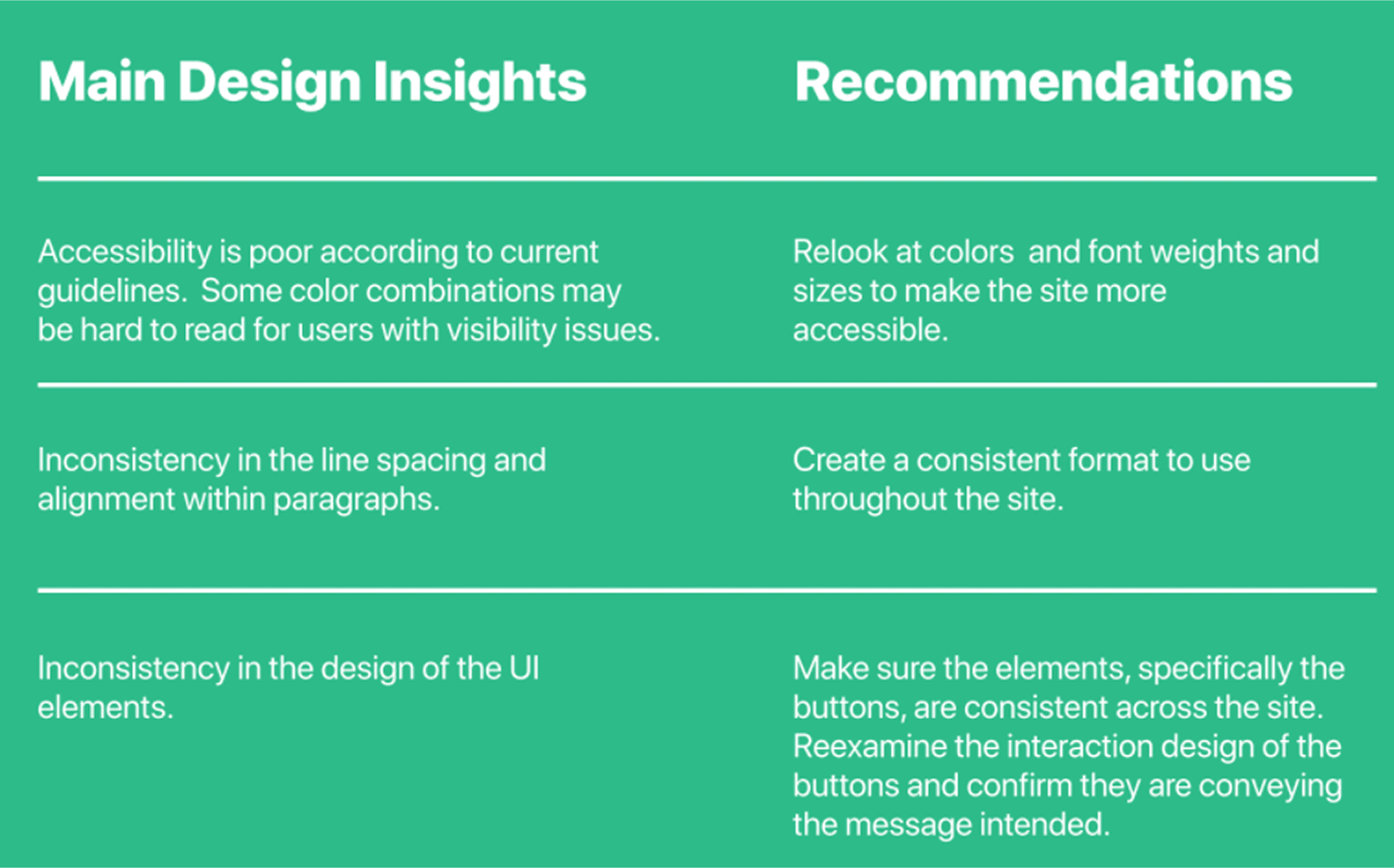
After understanding how competitors in similar industries onboarded their user, we did a heuristic evaluation using three of Jakob Nielsen’s usability heuristics to understand Xiggit’s interface better.
-Click here to view the heuristic evaluation-
Design Audit
Solution
Help users understand the benefits of Xiggit by educating them on saving tools and personalize the experience for users.
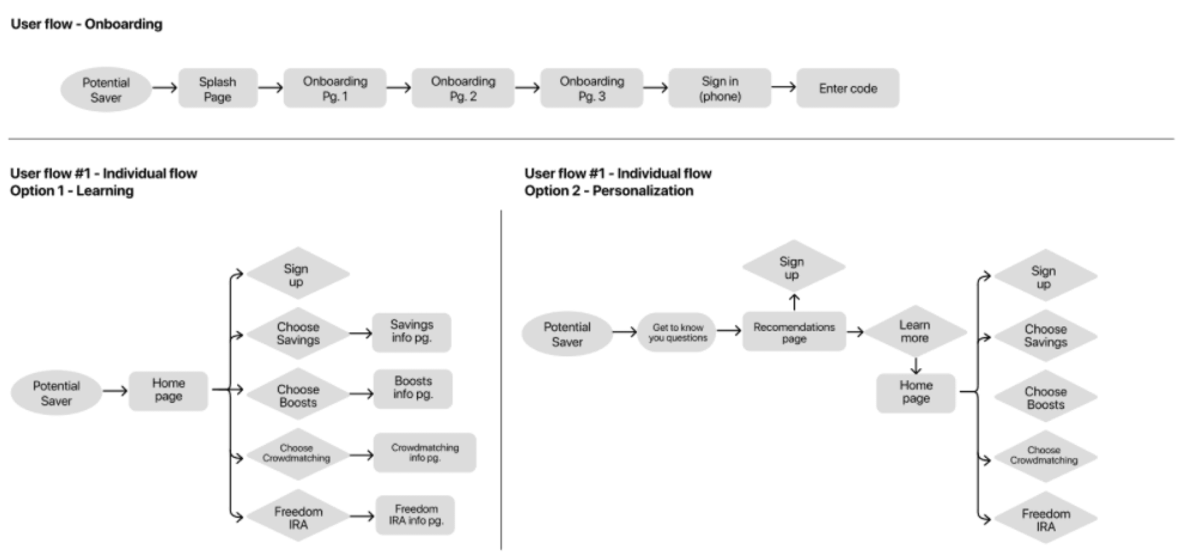
User Flow
Three user flows were created after the onboarding process, the first flow are for users who want to learn more about the app, then the second flow are for users who want a more personalized flow by answering “get to know you” questions
Design
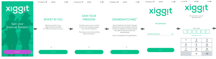
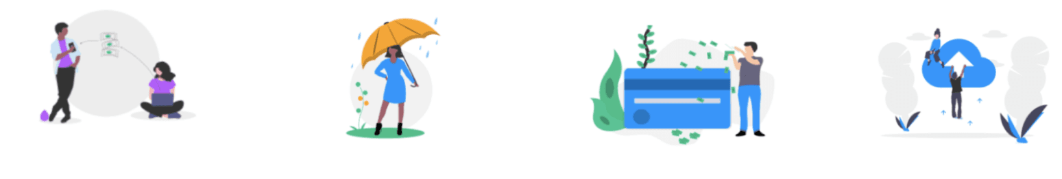
Finally the good stuff! — For color and Illustrations, we kept Xiggit’s existing green and purple color. Added new blue, peach, and yellow color to create a more colorful interface. The illustrations were found from a free kit and changed to the redesigned colors.
After the colors and illustrations were discussed with stakeholders, we created example screens to present and sample the design in high fidelity screens.

Outcomes
Xiggit’s team were pleased with the new onboarding designs. They noticed more transparency with the onboarding screens that led users to confidently link their bank accounts.
Working with Xiggit team helped me as a student to refine the interview questions into a more directed questions guiding users into telling their financial stories. I learned the importance of asking the right questions can make a big difference.
As we were working 40 hours a week, we had to add an extra week to gather all the findings and designs. Personally, I would have liked to add additional two weeks to conduct user testing and findings on the new onboarding designs. I am curious on how the final designs work with users.
A design collaboration with Springboard and Xiggit.
This project focuses on the redesign of the onboarding process for Xiggit's iOS app.
Company Overview
Xiggit is a start-up with about 10 employees, helping people save money through financial tools: creating emergency savings, building freedom savings, and earning money from their Boost game. They have existing research and an existing high fidelity design, the app has been launched with existing employees for a construction company.
Business Challenges
Xiggit is seeking a revamp of its existing onboarding process due to several concerns. According to their analytics, users successfully open savings accounts but fail to actively engage with the app. There is apprehension regarding the bank account linking screens, which are currently presented without providing any contextual information about the app.
The Problem
How do we acknowledge users' pain points (even when not saving) to increase user engagement and trust?
-View Xiggit's Existing User Flow -
Team
Carmela Abraham (Chief Product Officer)
Camila Benedetti (Marketing Coordinator)
Ambre Hautot (UX/UI Designer)
Michael Beaton (Software Engineer)
Keith Cobell (Advisor; Customer Delight)
Claudette Cariño
Jing Guo
Zhi Qiu
Role
UX Designer
UI Designer
UX Researcher
Duration
4 weeks (80 Hours)
Target Audience
Dollar store shopper
Age 25 and older
Low Income
Capable of spending money
Using up what they have
Hypothesis
Users may have a lack of knowledge/education to reach their financial goals. Users may be too young or do not believe they have the money to start saving
Research
I read scholarly articles, personal stories, and online articles to gather research about our target audience.
Here’s what I found:
Low-income families with savings are more financially resilient than middle-income families without savings (McKernan)
3 major reasons that stop low-income users from using a formal saving account: access, knowledge and understanding, and attractiveness of formal products.
Having a clear understanding of what financial health is can help (Smith)
-Click to read more-
Interview Insights
Reaching out to people to interviewing was challenging, especially during the peak of a pandemic. My team and I used Facebook, grocery stores, Slack channels, mutual friends, and existing Xiggit users. We conducted a total of 7 one-on-one interviews (30 minute each).
-Click here for interview script and notes-
We discovered:
Users learn a secure way to manage their finances or had previously faced hardships in their finances, which then shapes them to build their way to financial security.
Some users are financially supported, others are not which makes them more aware of their finances.
Saving and budgeting are built habits. Spending is a habit.
Xiggit's Competitors
To understand how similar apps function compared to Xiggit, we did an analysis on Chime, Mint, Acorn, and digit. Out of the four, Mint was able to view the app without linking any bank accounts. It had more user freedom without typing the user’s information on the onboarding - sign up process.
-Click here to view Mint’s analysis-
After understanding how competitors in similar industries onboarded their user, we did a heuristic evaluation using three of Jakob Nielsen’s usability heuristics to understand Xiggit’s interface better.
-Click here to view the heuristic evaluation-
Design Audit
Solution
Help users understand the benefits of Xiggit by educating them on saving tools and personalize the experience for users.
User Flow
Three user flows were created after the onboarding process, the first flow are for users who want to learn more about the app, then the second flow are for users who want a more personalized flow by answering “get to know you” questions
Design
Finally the good stuff! — For color and Illustrations, we kept Xiggit’s existing green and purple color. Added new blue, peach, and yellow color to create a more colorful interface. The illustrations were found from a free kit and changed to the redesigned colors.
After the colors and illustrations were discussed with stakeholders, we created example screens to present and sample the design in high fidelity screens.
Outcomes
Xiggit’s team were pleased with the new onboarding designs. They noticed more transparency with the onboarding screens that led users to confidently link their bank accounts.
Working with Xiggit team helped me as a student to refine the interview questions into a more directed questions guiding users into telling their financial stories. I learned the importance of asking the right questions can make a big difference.
As we were working 40 hours a week, we had to add an extra week to gather all the findings and designs. Personally, I would have liked to add additional two weeks to conduct user testing and findings on the new onboarding designs. I am curious on how the final designs work with users.
Case Studies
Check our other project case studies
Case Studies
Check our other project case studies

Case Studies
Check our other project case studies
© 2024 Zhi Qiu. All rights reserved.